

Fontstructions tagged with “Stamp”
- Any License
- Commercial Use
- Downloadable
- Cloneable
- All Rights Reserved
- Creative Commons Attribution Non-commercial No Derivatives
- Creative Commons Attribution Non-commercial Share Alike
- Creative Commons Attribution Non-commercial
- Creative Commons Attribution No Derivatives
- Creative Commons Attribution Share Alike
- Creative Commons Attribution
- FontStruct Non-Commercial License
- FontStruct License
- Creative Commons CC0 Public Domain Dedication
- Open Font License
- Staff Picks (3)
- All (41)
sn blinds
by snhussainBalanced Rating: 0.00
Average Rating: 0.00
Click for more information about this rating. 0 votes You voted ? for this FontStruction. You may change your vote at any time.

Last edited: 20th January, 2012
Created: 10th June, 2011
The inspiration to this is the classic IBM logo. I wanted to create something like it with a few additions. 1. Wanted more lines. 2. Wanted more jaggedy edges on purpose. Here, I tried to focus not only making more lines to construct the glyph but also to see how two glyphs will go together. I will post a few samples soon. I like how two glyphs, when put together are making a nice kern. It's good to see how mechanical yet traditional this is looking. Something that I wanted. Suggestions are always welcome.
Dmdw
by martha97Balanced Rating: 0.00
Average Rating: 0.00
Click for more information about this rating. 0 votes You voted ? for this FontStruction. You may change your vote at any time.
Last edited: 24th October, 2016
Created: 24th October, 2016
I have created this font using the word "destructive" as a theme. After experimenting with a number of ideas I created this font by cutting it out of card in a distressed way, then projecting light through it on the wall, photographing the results and recreating the result in fontstruct. I feel as if my font could be used for a number of different things such posters or advertisement for art or music event.
Glyphstamp 1x1
by zephramBalanced Rating: 0.00
Average Rating: 0.00
Click for more information about this rating. 0 votes You voted ? for this FontStruction. You may change your vote at any time.
Analogue Fizz Stamped
by elenavsBalanced Rating: 0.00
Average Rating: 0.00
Click for more information about this rating. 0 votes You voted ? for this FontStruction. You may change your vote at any time.
Last edited: 18th October, 2023
Created: 18th October, 2023
This typeface is based on the hand-painted names seen on the side of canal boats. The inconsistent, grainy texture of each letter is meant to represent the irregularities in using paint, for example the general wear and tear from the elements like chipped or peeling edges. This was my approach to the idea of “analogue” and a brief set to explore what that means. To me, in the context of the brief, analogue could be defined as possessing a nostalgic or "old school" quality- something replicated in an unauthentic manner in order to create a look-alike imitation of a time gone by. I focused on the old method of transport in Bristol: boats. To further this idea of a 'time gone by', I created this font in the set to look like ink stamped letters.
This is a clone of 1st Draft of Analogue Fizzreally typrwritten
by Lydia H. S.Balanced Rating: 0.00
Average Rating: 0.00
Click for more information about this rating. 0 votes You voted ? for this FontStruction. You may change your vote at any time.
postage
by jinxBalanced Rating: 6.63
Average Rating: 4.00
Click for more information about this rating. 2 votes You voted ? for this FontStruction. You may change your vote at any time.
A' Teck
by Jail99 (jail9)Balanced Rating: 6.72
Average Rating: 5.50
Click for more information about this rating. 4 votes You voted ? for this FontStruction. You may change your vote at any time.
ProLamina Stencil
by Alejandro Cabrera Avila (superhuasteco)Balanced Rating: 6.86
Average Rating: 6.50
Click for more information about this rating. 12 votes You voted ? for this FontStruction. You may change your vote at any time.
Last edited: 13th March, 2009
Created: 25th January, 2009
Clone of ProLamina 2. Stencil version.This is a clone of ProLamina Segmentada
epic
by Patrick Gregory (snooppuppy1)Balanced Rating: 7.33
Average Rating: 5.00
Click for more information about this rating. 1 vote You voted ? for this FontStruction. You may change your vote at any time.
Stamped Two
by Mattia Cuttini (MattiaC)Balanced Rating: 7.41
Average Rating: 7.00
Click for more information about this rating. 5 votes You voted ? for this FontStruction. You may change your vote at any time.
Last edited: 9th November, 2022
Created: 16th August, 2021
Experimental modular font from 2018.
Enjoy.
linktr.ee/mattiacprodukt
POSTCODE
by nitradaBalanced Rating: 7.55
Average Rating: 7.50
Click for more information about this rating. 26 votes You voted ? for this FontStruction. You may change your vote at any time.
Last edited: 4th January, 2009
Created: 6th June, 2008
This is still work in progress, a lot of characters missing. There are only UPPERCASE characters available, I filled the lowercase letters with random symbols/patterns. The design is based on this stamp design from 1978 by Gert Dumbar. Use font sizes 64, 128 or 256px. Set leading to 24 (for font size 64), 48 (for 128) and 96 (for 256). More information
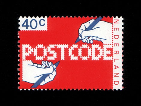
Tri-peat
by mboxallBalanced Rating: 7.58
Average Rating: 7.25
Click for more information about this rating. 4 votes You voted ? for this FontStruction. You may change your vote at any time.
Last edited: 6th December, 2010
Created: 26th October, 2010
This is my first typeface created with FontStruct in the first term studying Graphic Design at the University of the West of England, Bristol. Any suggestions and improvements welcome. The typeface is inspired by all things repeated within the city of Bristol, including architecture, objects and shapes.
Perforater
by lldaddyBalanced Rating: 7.91
Average Rating: 8.00
Click for more information about this rating. 1 vote You voted ? for this FontStruction. You may change your vote at any time.
Menagerie 5
by zephramBalanced Rating: 7.91
Average Rating: 8.00
Click for more information about this rating. 1 vote You voted ? for this FontStruction. You may change your vote at any time.
Last edited: 31st October, 2018
Created: 18th September, 2018
A design that looks like a gallery of paintings or postage stamps. Made with glyphs from my 5x5 designs - the pixel ones as well as the high-res ones!
There are very few sizes/ratios which make every glyph look pristine. This lets the user incorporate its own presentation into things! I think this looks best at 2x-4x Pixel size.
I'll make more glyphs once I have more unique designs to sample glyphs from! Perhaps some glyphs can be based on letterforms which I liked but didn't develop into full fonts...
Can you identify every font represented here? If so, good for you! I can't. :D
Thunderball Distressed
by Jamie Place (FontBlast)Balanced Rating: 8.09
Average Rating: 8.50
Click for more information about this rating. 2 votes You voted ? for this FontStruction. You may change your vote at any time.
Last edited: 29th November, 2012
Created: 29th November, 2012
Clone of Thunderball. When wanting to make this font lighter, I realised it made the font look rugged. But I liked it, so I stayed with it. This is a clone of Thunderball
All Stars DX
by zephramBalanced Rating: 8.10
Average Rating: 9.00
Click for more information about this rating. 1 vote You voted ? for this FontStruction. You may change your vote at any time.
Last edited: 13th May, 2018
Created: 13th May, 2018
Finally, an All Stars that is truly "all" "stars" HAHAHA GEDDIT
This is a clone of All Stars BlackMisplaced Baubles
by zephramBalanced Rating: 8.10
Average Rating: 9.00
Click for more information about this rating. 1 vote You voted ? for this FontStruction. You may change your vote at any time.
Last edited: 6th December, 2018
Created: 7th April, 2018
An attempt to make low-resolution, circled letters without the use of filters. Reminds me of branding irons or stencils. The name is based on a friend's joke about lost marbles. :^)
*
TIP: This one looks best at smaller sizes (24pt or less) and with antialiasing/ClearType turned on!
Horrible Stamp ChT
by chavez ravineBalanced Rating: 8.19
Average Rating: 8.50
Click for more information about this rating. 4 votes You voted ? for this FontStruction. You may change your vote at any time.
7x7:2-classic
by ssaammBalanced Rating: 8.21
Average Rating: 8.67
Click for more information about this rating. 3 votes You voted ? for this FontStruction. You may change your vote at any time.
Paws
by dmmaosBalanced Rating: 8.25
Average Rating: 9.00
Click for more information about this rating. 2 votes You voted ? for this FontStruction. You may change your vote at any time.
Eighties Computer
by annamattheosBalanced Rating: 8.25
Average Rating: 9.00
Click for more information about this rating. 2 votes You voted ? for this FontStruction. You may change your vote at any time.
- Black (594)
- Block (913)
- Bold (1838)
- Heavy (524)
- Square (1378)
- Display (3008)
- Lowercase (223)
- Uppercase (317)
- Strong (112)
- Fun (459)
- Computer (687)
- Box (166)
- Slab (240)
- Large (140)
- Link (21)
- Base (8)
- Metal (156)
- Cut (84)
- Carve (2)
- Carved (18)
- Shape (46)
- Sturdy (3)
- Shadow (189)
- Big (163)
- Indent (3)
- Impression (1)
- Stamp (42)
- Letters (109)
- Alphabet (159)
All Stars Plain
by zephramBalanced Rating: 8.30
Average Rating: 10.00
Click for more information about this rating. 1 vote You voted ? for this FontStruction. You may change your vote at any time.
All Stars Black
by zephramBalanced Rating: 8.30
Average Rating: 10.00
Click for more information about this rating. 1 vote You voted ? for this FontStruction. You may change your vote at any time.
Ultrablack
by zephramBalanced Rating: 8.30
Average Rating: 10.00
Click for more information about this rating. 1 vote You voted ? for this FontStruction. You may change your vote at any time.
Derpberd Illuminated 11x11
by zephramBalanced Rating: 8.30
Average Rating: 10.00
Click for more information about this rating. 1 vote You voted ? for this FontStruction. You may change your vote at any time.
Last edited: 2nd April, 2018
Created: 2nd April, 2018
11x11 version of Illuminated Flamingo. Made to achieve a hybrid look between Derpberd Condensed and Gremlin 3x6, allowing this to be used with a greater range of microfont styles.
This is a clone of Derpberd Illuminated 12x12Spacekommando
by zephramBalanced Rating: 8.30
Average Rating: 10.00
Click for more information about this rating. 1 vote You voted ? for this FontStruction. You may change your vote at any time.
Last edited: 31st October, 2018
Created: 24th October, 2018
From the vault of unpublished doodles, a permutation of earlier ideas.
*
See also:Spacekapitan, Spacekommand
Might Gems
by zephramBalanced Rating: 8.30
Average Rating: 10.00
Click for more information about this rating. 1 vote You voted ? for this FontStruction. You may change your vote at any time.
Last edited: 17th December, 2018
Created: 11th November, 2018
Just a variation of an existing design. Spacing values were changed to break the chains, and "space" & "no-break space" were made blank.
This is a clone of Might Chaindb catch
by beateBalanced Rating: 8.32
Average Rating: 8.44
Click for more information about this rating. 16 votes You voted ? for this FontStruction. You may change your vote at any time.
Portable Vengeance Inverse
by zephramBalanced Rating: 8.41
Average Rating: 9.50
Click for more information about this rating. 2 votes You voted ? for this FontStruction. You may change your vote at any time.
Last edited: 23rd September, 2018
Created: 11th July, 2018
Portable Vengeance in negative. A few glyphs (such as "Q") were truncated for the grid.
Rather than spacing this so the blocks form a continuous reel, as I usually do, I decided to let things be a bit spaced out. This makes the font much better at attracting attention. And, since this is made to show system messages in games and consoles, it works out!
Zigourati
by zephramBalanced Rating: 8.41
Average Rating: 9.50
Click for more information about this rating. 2 votes You voted ? for this FontStruction. You may change your vote at any time.
a krat 3
by automBalanced Rating: 8.49
Average Rating: 9.33
Click for more information about this rating. 3 votes You voted ? for this FontStruction. You may change your vote at any time.
Gremlin Emojis
by zephramBalanced Rating: 8.55
Average Rating: 9.25
Click for more information about this rating. 4 votes You voted ? for this FontStruction. You may change your vote at any time.
Last edited: 3rd June, 2018
Created: 3rd June, 2018
The "gremoji" symbols used in Virtual Gremlin. These are spoken to the player by those Gremlins who are not intelligent enough to form words, and can be used to guage the Gremlins' moods.
Original size: 21pt (use multiples of this value for pixel perfection)