

Fontstructions tagged with “Stamp”
- Any License
- Commercial Use
- Downloadable
- Cloneable
- All Rights Reserved
- Creative Commons Attribution Non-commercial No Derivatives
- Creative Commons Attribution Non-commercial Share Alike
- Creative Commons Attribution Non-commercial
- Creative Commons Attribution No Derivatives
- Creative Commons Attribution Share Alike
- Creative Commons Attribution
- FontStruct Non-Commercial License
- FontStruct License
- Creative Commons CC0 Public Domain Dedication
- Open Font License
- Staff Picks (3)
- All (41)
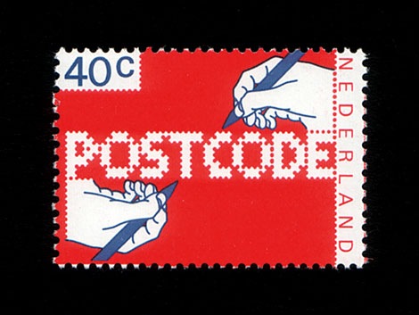
POSTCODE
by nitradaBalanced Rating: 7.55
Average Rating: 7.50
Click for more information about this rating. 26 votes You voted ? for this FontStruction. You may change your vote at any time.

Last edited: 4th January, 2009
Created: 6th June, 2008
This is still work in progress, a lot of characters missing. There are only UPPERCASE characters available, I filled the lowercase letters with random symbols/patterns. The design is based on this stamp design from 1978 by Gert Dumbar. Use font sizes 64, 128 or 256px. Set leading to 24 (for font size 64), 48 (for 128) and 96 (for 256). More information
sn blinds
by snhussainBalanced Rating: 0.00
Average Rating: 0.00
Click for more information about this rating. 0 votes You voted ? for this FontStruction. You may change your vote at any time.
Last edited: 20th January, 2012
Created: 10th June, 2011
The inspiration to this is the classic IBM logo. I wanted to create something like it with a few additions. 1. Wanted more lines. 2. Wanted more jaggedy edges on purpose. Here, I tried to focus not only making more lines to construct the glyph but also to see how two glyphs will go together. I will post a few samples soon. I like how two glyphs, when put together are making a nice kern. It's good to see how mechanical yet traditional this is looking. Something that I wanted. Suggestions are always welcome.
Might Chain
by zephramBalanced Rating: 8.67
Average Rating: 9.14
Click for more information about this rating. 7 votes You voted ? for this FontStruction. You may change your vote at any time.
Last edited: 4th May, 2019
Created: 10th September, 2018
Some kind of great big ol' chain.
In retrospect, I think it looks like a jewelry chain from a dwarven civilization. Perhaps the hypothetical jeweler cut and ground the stones in an imitation of some dwarven font!
When glyphs are used in isolation, they somewhat resemble carved signets or seals. Increasing the letter spacing allows you to create a variation of the design. (This is something that must be done in-software since the font will render as monospaced by default.)
*
12SEP2018: Added lowercase... the low resolution combined with the design method make it very difficult to render distinctive lowercase versions of every letter, but I'll keep working on it. There's a lot of similarity between pairs like S/5, Z/2, etc., so this font is most effectively used in forms of writing wherein context suffices to inform the reader as to the identity of each glyph (lists, prose, and technical writings). If you want to use this in a password system or something, I recommend using one case's glyphs only.
*
Design Rules:
1. Negative spaces will be areas of 0.5 bricks' effective length or width.
2. Negative spaces may exceed the 0.5 measurement only by increments of 0.5 and in only one dimension at a time.
3. Glyphs will fill their framed canvasses to the greatest extent possible while adhering to the other rules.
- Public Domain (811)
- Free (949)
- Cartoon (82)
- Blocky (517)
- Chain (24)
- Interwoven (1)
- Framed (29)
- 100% Constant Height (43)
- Stamp (42)
- Signet (3)
- Dense (46)
- Doodle (162)
- 10x10 (14)
- 10x10 HD Collection (6)
- Geometric (841)
- Sgraffito (7)
- Connected (188)
- Dwarf (15)
- Dwarven (21)
- Octagon (43)
- Octagonal (185)
- Display (3004)
- High Contrast (81)
- E5x5 (10)
- Fontspace (154)
- Tire (2)
- Tracks (10)
- Strong (112)
- Constant Width (11)
db catch
by beateBalanced Rating: 8.32
Average Rating: 8.44
Click for more information about this rating. 16 votes You voted ? for this FontStruction. You may change your vote at any time.
MLS Seals Basic
by melissasoupBalanced Rating: 8.92
Average Rating: 10.00
Click for more information about this rating. 4 votes You voted ? for this FontStruction. You may change your vote at any time.
Last edited: 18th September, 2013
Created: 17th September, 2013
Seal stamps! Here are 62 stamps (all basic Latin letters and numbers) bearing various Chinese characters in seal script. Included are the zodiac animals, seasons, elements, virtues, and some miscellaneous bits. DISCLAIMER: I have studied Chinese, but I am not a native reader. Please keep this in mind; I am not liable for any issues regarding its use. However, I am definitely open to suggestions and critique! A key to the characters can be found here: http://i.imgur.com/ZHTeSt8.png
Mythical Bursts
by zephramBalanced Rating: 8.55
Average Rating: 9.25
Click for more information about this rating. 4 votes You voted ? for this FontStruction. You may change your vote at any time.
Last edited: 10th December, 2018
Created: 21st June, 2018
"Mythical Bursts" is an anagram of "Bismuth Crystal". The design is inspired by said crystals as well as Mayan/Aztec carvings (or at least, the comparatively simple forms they have in popular media) and sgraffito art in which a surface is scratched off to reveal a contrasting material underneath.
12SEP2018: I've edited every glyph in order to disconnect the letterforms from their enclosing shapes. This makes the font much more readable and consistent.
*
Original size: 42pt (use multiples of this value for pixel perfection)
- Public Domain (811)
- 48x48 (1)
- Square (1372)
- Constant Height (166)
- Monospaced (826)
- Bent Lines (1)
- Stamp (42)
- Mazelike (4)
- Mayan (10)
- Aztec (17)
- Ruins (7)
- Carved (18)
- Sgraffito (7)
- Seal (10)
- 100% Constant Height (43)
- Bismuth (2)
- Multiline (66)
- Optical Illusion (45)
- Black (590)
- Spelunky (3)
- Olmec (4)
- Free (949)
- High Resolution Pixel (45)
- Pixel (7437)
- Blocky (517)
- High Contrast (81)
- Doodle (162)
- Constant Width (11)
- No Wasted Matrix (21)
ProLamina Stencil
by Alejandro Cabrera Avila (superhuasteco)Balanced Rating: 6.86
Average Rating: 6.50
Click for more information about this rating. 12 votes You voted ? for this FontStruction. You may change your vote at any time.
Last edited: 13th March, 2009
Created: 25th January, 2009
Clone of ProLamina 2. Stencil version.This is a clone of ProLamina Segmentada
Tri-peat
by mboxallBalanced Rating: 7.57
Average Rating: 7.25
Click for more information about this rating. 4 votes You voted ? for this FontStruction. You may change your vote at any time.
Last edited: 6th December, 2010
Created: 26th October, 2010
This is my first typeface created with FontStruct in the first term studying Graphic Design at the University of the West of England, Bristol. Any suggestions and improvements welcome. The typeface is inspired by all things repeated within the city of Bristol, including architecture, objects and shapes.
Misplaced Baubles
by zephramBalanced Rating: 8.10
Average Rating: 9.00
Click for more information about this rating. 1 vote You voted ? for this FontStruction. You may change your vote at any time.
Last edited: 6th December, 2018
Created: 7th April, 2018
An attempt to make low-resolution, circled letters without the use of filters. Reminds me of branding irons or stencils. The name is based on a friend's joke about lost marbles. :^)
*
TIP: This one looks best at smaller sizes (24pt or less) and with antialiasing/ClearType turned on!
Ultrablack
by zephramBalanced Rating: 8.29
Average Rating: 10.00
Click for more information about this rating. 1 vote You voted ? for this FontStruction. You may change your vote at any time.
Zigourat
by zephramBalanced Rating: 8.57
Average Rating: 10.00
Click for more information about this rating. 2 votes You voted ? for this FontStruction. You may change your vote at any time.
Last edited: 22nd September, 2018
Created: 22nd September, 2018
A design that looks like a top-down view of ziggurats!
I composited the diacritics so they'd fit into place, but this means that most anything non-English needs to be pretty large to be unambiguously read...
- Public Domain (811)
- Free (949)
- 11x11 (21)
- Framed (29)
- Captive (16)
- Connected (188)
- Ziggurat (2)
- Pyramid (7)
- Reticle (5)
- E3x3 (6)
- Maze (83)
- Path (8)
- Quadratic (10)
- Doodle (162)
- Stamp (42)
- Sans Serif (2749)
- Display (3004)
- Experimental (336)
- Square (1372)
- Temple (10)
- Ruins (7)
- Illusion (53)
- Optical Illusion (45)
- Rounded Square (2)
- Fontspace (154)
All Stars Plain
by zephramBalanced Rating: 8.29
Average Rating: 10.00
Click for more information about this rating. 1 vote You voted ? for this FontStruction. You may change your vote at any time.
Stamped Two
by Mattia Cuttini (MattiaC)Balanced Rating: 7.40
Average Rating: 7.00
Click for more information about this rating. 5 votes You voted ? for this FontStruction. You may change your vote at any time.
Last edited: 9th November, 2022
Created: 16th August, 2021
Experimental modular font from 2018.
Enjoy.
linktr.ee/mattiacprodukt
7x7:2-classic
by ssaammBalanced Rating: 8.21
Average Rating: 8.67
Click for more information about this rating. 3 votes You voted ? for this FontStruction. You may change your vote at any time.
Thunderball Distressed
by Jamie Place (FontBlast)Balanced Rating: 8.08
Average Rating: 8.50
Click for more information about this rating. 2 votes You voted ? for this FontStruction. You may change your vote at any time.
Last edited: 29th November, 2012
Created: 29th November, 2012
Clone of Thunderball. When wanting to make this font lighter, I realised it made the font look rugged. But I liked it, so I stayed with it. This is a clone of Thunderball
Spacekommando
by zephramBalanced Rating: 8.29
Average Rating: 10.00
Click for more information about this rating. 1 vote You voted ? for this FontStruction. You may change your vote at any time.
Last edited: 31st October, 2018
Created: 24th October, 2018
From the vault of unpublished doodles, a permutation of earlier ideas.
*
See also:Spacekapitan, Spacekommand
Paws
by dmmaosBalanced Rating: 8.24
Average Rating: 9.00
Click for more information about this rating. 2 votes You voted ? for this FontStruction. You may change your vote at any time.
Stampilic
by lldaddyBalanced Rating: 8.72
Average Rating: 9.11
Click for more information about this rating. 9 votes You voted ? for this FontStruction. You may change your vote at any time.
epic
by Patrick Gregory (snooppuppy1)Balanced Rating: 7.33
Average Rating: 5.00
Click for more information about this rating. 1 vote You voted ? for this FontStruction. You may change your vote at any time.
All Stars Black
by zephramBalanced Rating: 8.29
Average Rating: 10.00
Click for more information about this rating. 1 vote You voted ? for this FontStruction. You may change your vote at any time.
Zigourati
by zephramBalanced Rating: 8.40
Average Rating: 9.50
Click for more information about this rating. 2 votes You voted ? for this FontStruction. You may change your vote at any time.
Horrible Stamp ChT
by chavez ravineBalanced Rating: 8.18
Average Rating: 8.50
Click for more information about this rating. 4 votes You voted ? for this FontStruction. You may change your vote at any time.
Perforater
by lldaddyBalanced Rating: 7.90
Average Rating: 8.00
Click for more information about this rating. 1 vote You voted ? for this FontStruction. You may change your vote at any time.
Derpberd Illuminated 12x12
by zephramBalanced Rating: 8.76
Average Rating: 10.00
Click for more information about this rating. 3 votes You voted ? for this FontStruction. You may change your vote at any time.
Last edited: 14th April, 2018
Created: 1st April, 2018
A 12x12 pixel font designed for use alongside microfonts, especially the "Derpberd" family it's modeled after. These large letters help decorate the start of a new chapter in a manner similar to the art fonts of illuminated manuscripts. I think this makes a decent "high-tech" or "board game" font, too! :D
Alternate style on lowercase (alternate ,.!? are on <>/~). The symbols and numerals have a slightly altered frame to help differentiate them and add some flavor.
a krat 3
by automBalanced Rating: 8.49
Average Rating: 9.33
Click for more information about this rating. 3 votes You voted ? for this FontStruction. You may change your vote at any time.
All Stars DX
by zephramBalanced Rating: 8.10
Average Rating: 9.00
Click for more information about this rating. 1 vote You voted ? for this FontStruction. You may change your vote at any time.
Last edited: 13th May, 2018
Created: 13th May, 2018
Finally, an All Stars that is truly "all" "stars" HAHAHA GEDDIT
This is a clone of All Stars BlackGremlin Emojis
by zephramBalanced Rating: 8.55
Average Rating: 9.25
Click for more information about this rating. 4 votes You voted ? for this FontStruction. You may change your vote at any time.
Last edited: 3rd June, 2018
Created: 3rd June, 2018
The "gremoji" symbols used in Virtual Gremlin. These are spoken to the player by those Gremlins who are not intelligent enough to form words, and can be used to guage the Gremlins' moods.
Original size: 21pt (use multiples of this value for pixel perfection)
Portable Vengeance Inverse
by zephramBalanced Rating: 8.40
Average Rating: 9.50
Click for more information about this rating. 2 votes You voted ? for this FontStruction. You may change your vote at any time.
Last edited: 23rd September, 2018
Created: 11th July, 2018
Portable Vengeance in negative. A few glyphs (such as "Q") were truncated for the grid.
Rather than spacing this so the blocks form a continuous reel, as I usually do, I decided to let things be a bit spaced out. This makes the font much better at attracting attention. And, since this is made to show system messages in games and consoles, it works out!
A' Teck
by Jail99 (jail9)Balanced Rating: 6.72
Average Rating: 5.50
Click for more information about this rating. 4 votes You voted ? for this FontStruction. You may change your vote at any time.
Philatelligent
by AeolienBalanced Rating: 8.76
Average Rating: 10.00
Click for more information about this rating. 3 votes You voted ? for this FontStruction. You may change your vote at any time.
Eighties Computer
by annamattheosBalanced Rating: 8.24
Average Rating: 9.00
Click for more information about this rating. 2 votes You voted ? for this FontStruction. You may change your vote at any time.
- Black (590)
- Block (911)
- Bold (1837)
- Heavy (521)
- Square (1372)
- Display (3004)
- Lowercase (223)
- Uppercase (315)
- Strong (112)
- Fun (459)
- Computer (685)
- Box (166)
- Slab (240)
- Large (138)
- Link (21)
- Base (8)
- Metal (156)
- Cut (84)
- Carve (2)
- Carved (18)
- Shape (46)
- Sturdy (3)
- Shadow (189)
- Big (163)
- Indent (3)
- Impression (1)
- Stamp (42)
- Letters (107)
- Alphabet (156)
All Stars
by zephramBalanced Rating: 8.57
Average Rating: 10.00
Click for more information about this rating. 2 votes You voted ? for this FontStruction. You may change your vote at any time.
Last edited: 9th May, 2018
Created: 8th May, 2018
A star font which combines a pixelated look with halftone shading.
It needs some form of antialiasing to be legible at small sizes. (See sample below or try the Pixel views). At larger sizes, you can use it with or without antialiasing!
Original size: 12pt (use multiples of this value for pixel perfection)