

Browse and find FontStructions
- Any License
- Commercial Use
- Downloadable
- Cloneable
- All Rights Reserved
- Creative Commons Attribution Non-commercial No Derivatives
- Creative Commons Attribution Non-commercial Share Alike
- Creative Commons Attribution Non-commercial
- Creative Commons Attribution No Derivatives
- Creative Commons Attribution Share Alike
- Creative Commons Attribution
- FontStruct Non-Commercial License
- FontStruct License
- Creative Commons CC0 Public Domain Dedication
- Open Font License
- Staff Picks (369)
- All (4217)
Csillagok
by LexKominekBalanced Rating: 8.53
Average Rating: 8.80
Click for more information about this rating. 10 votes You voted ? for this FontStruction. You may change your vote at any time.

Written Thorns
by Frederic F. (Star Script Writer)Balanced Rating: 8.44
Average Rating: 8.60
Click for more information about this rating. 15 votes You voted ? for this FontStruction. You may change your vote at any time.
Coming Soon
by GoatmealBalanced Rating: 0.00
Average Rating: 0.00
Click for more information about this rating. 0 votes You voted ? for this FontStruction. You may change your vote at any time.
Basmachi
by naverhtradBalanced Rating: 7.93
Average Rating: 7.94
Click for more information about this rating. 18 votes You voted ? for this FontStruction. You may change your vote at any time.
Boredoni
by sebastianbernsBalanced Rating: 8.02
Average Rating: 8.05
Click for more information about this rating. 20 votes You voted ? for this FontStruction. You may change your vote at any time.
Underground
by Magic SamBalanced Rating: 7.64
Average Rating: 7.55
Click for more information about this rating. 11 votes You voted ? for this FontStruction. You may change your vote at any time.
Last edited: 11th September, 2009
Created: 3rd September, 2009
If you want to create cool Letterings, try Underground! This was inspired by Pincoya Black Type by Daniel Hernandez. You can write letter by letter using the Uppercase or you can connect every character using the alternates. Please take a look at the example, then you´ll understand the idea! Lowercase are alternates of the same letter or a different letter. >=alt.B, <=alt.D, @=alt.T Underline:=+, Overline=*, Filter: 1,6.
Bravado Block Thin
by josephghayesBalanced Rating: 7.58
Average Rating: 7.44
Click for more information about this rating. 9 votes You voted ? for this FontStruction. You may change your vote at any time.
Freestyle
by Magic SamBalanced Rating: 7.64
Average Rating: 7.57
Click for more information about this rating. 14 votes You voted ? for this FontStruction. You may change your vote at any time.
Last edited: 13th September, 2009
Created: 8th August, 2009
Freestyle is not a usual font, as you see. The concept was inspired by the "How very Tokyo"-poster by Spin (I posted it in the comments). I liked the idea of cutting every letter into pieces so it looks artistic but is still readable. Freestyle consists of three parts: the whole letter at the top and in the middle/at the bottom there are parts of it, cut vertically. Upper- and Lowercase are different. Under construction, more glyphs to come. This can be used e.g. for posters or magazine layouts. What do you think about this experiment? < = alt.I > = alt.I * = alt.space # = alt.space
Jettison Stencil
by afrojetBalanced Rating: 8.22
Average Rating: 8.26
Click for more information about this rating. 35 votes You voted ? for this FontStruction. You may change your vote at any time.
Last edited: 22nd June, 2009
Created: 11th August, 2008
jet-ti-son -verb 1. to cast (goods) overboard in order to lighten a vessel or aircraft or to improve its stability in an emergency. 2. to throw off (something) as an obstacle or burden; discard. -noun 1. the act of casting goods from a vessel or aircraft to lighten or stabilize it.
Squint
by reusBalanced Rating: 8.54
Average Rating: 8.56
Click for more information about this rating. 132 votes You voted ? for this FontStruction. You may change your vote at any time.
F77 Soprano
by anonymous-1520403Balanced Rating: 8.67
Average Rating: 9.14
Click for more information about this rating. 7 votes You voted ? for this FontStruction. You may change your vote at any time.
SproutsGd2016_yolanda15067
by Yolanda ZiporaBalanced Rating: 0.00
Average Rating: 0.00
Click for more information about this rating. 0 votes You voted ? for this FontStruction. You may change your vote at any time.
Last edited: 2nd May, 2016
Created: 30th March, 2016
typeface ini terinspirasi dari kecambah yang terdapat dalam makanan khas Indonesia Gado-gado. nama dari typeface ini sendiri Sprouts berasal dari bahasa Inggris yang berarti Kecambah, Gd yang merupakan singkatan dari Gado-Gado dan 2016 berdasarkan tahun pembuatannya. silahkan tulis kritik dan saran kalian dalam komentar di bawah. terimakasih.
BebekPexel_Diana15086
by RanaiDBalanced Rating: 0.00
Average Rating: 0.00
Click for more information about this rating. 0 votes You voted ? for this FontStruction. You may change your vote at any time.
Last edited: 30th April, 2016
Created: 26th March, 2016
A rather simple typeface inspired from Lamongan of East Java's special dish, Pecel. A meal made of rice topped with herb, served with fried meat (usually duck, catfish, chicken, etc.), fried tofu and tempe, cucumber slices, basil, and cabbage slices.
This typeface features a simplified and pixelated design combined with duck features, to emphasis the specialty of Bebek Pecel. Hence the name of Bebek Pexel (Pecel Pixel).
pecelele_vernacularpetra2016_belinda15100
by bel'fBalanced Rating: 7.91
Average Rating: 8.00
Click for more information about this rating. 1 vote You voted ? for this FontStruction. You may change your vote at any time.
Apricot
by LexKominekBalanced Rating: 8.58
Average Rating: 8.71
Click for more information about this rating. 21 votes You voted ? for this FontStruction. You may change your vote at any time.
fs old-ish
by HoulaiziaaBalanced Rating: 9.18
Average Rating: 9.78
Click for more information about this rating. 9 votes You voted ? for this FontStruction. You may change your vote at any time.
FS Flower Shop
by HoulaiziaaBalanced Rating: 8.12
Average Rating: 8.19
Click for more information about this rating. 16 votes You voted ? for this FontStruction. You may change your vote at any time.
Tortise
by BismuthBalanced Rating: 8.84
Average Rating: 9.50
Click for more information about this rating. 6 votes You voted ? for this FontStruction. You may change your vote at any time.
Indonesian Woman
by Adien Gunarta (Adien Gunarta)Balanced Rating: 8.69
Average Rating: 8.88
Click for more information about this rating. 17 votes You voted ? for this FontStruction. You may change your vote at any time.
Last edited: 10th April, 2011
Created: 9th April, 2011
This font contains 12 women traditional style from any place in Indonesia. A = Javanese Women (Java) B = North Sumatra woman C = Minang woman (West Sumatra) D = Malay woman (Lampung) E = Balinese woman (Bali) F = East Nusa Tenggara woman G = Jambi woman (Jambi) H = Javanese woman 2 (West Java) I = Dayak woman (West Kalimantan/Borneo) J = Dayak woman 2 (East Kalimantan/Borneo) K = Batak Karo woman (West Sumatra) L = Minang woman wedding style (West Sumatra)
the tiniest font
by dawn.blairrBalanced Rating: 7.93
Average Rating: 8.00
Click for more information about this rating. 3 votes You voted ? for this FontStruction. You may change your vote at any time.
Digi3D
by Dominik Kaisers (phate888)Balanced Rating: 8.56
Average Rating: 8.65
Click for more information about this rating. 34 votes You voted ? for this FontStruction. You may change your vote at any time.
Dinosaur Gothic
by LexKominekBalanced Rating: 8.25
Average Rating: 8.33
Click for more information about this rating. 18 votes You voted ? for this FontStruction. You may change your vote at any time.
Last edited: 17th October, 2010
Created: 5th October, 2010
Loosely based on the custom lettering I did for my DINOSAUR logo (http://www.thedinosaur.ca). I wanted to make an old-school compressed gothic that didn't look like it was made in fontstruct. Could be good for movie poster credits.
kabog
by Michel Troy ~UrbanPixel~ (Upixel)Balanced Rating: 8.43
Average Rating: 8.52
Click for more information about this rating. 27 votes You voted ? for this FontStruction. You may change your vote at any time.
Last edited: 21st April, 2011
Created: 17th August, 2010
variation on a theme. =========================================== Everything star with characters d and g witch are a remodel or a variation of the fonstruct logo font. I wanted it readable without the white stripes witch permit me to add smoothness inside the glyph ================================== I did'nt went trought all FS searching if an another font like this one already exist, I think no. If you find one, tell me. =========================================== I still have to play with diatrics, not quite happy yet. Voilà! as always be welcome with constructive crits. I've to do something with the 3, my brain is dead for now ============================================ Congrats to pauldhunt witch made a great job with Structurosa. Before creating this font I especially did'nt want to look at his fonts for not interfered with the concept I had in my head. One exception,the x witch I had no good idea so I took it from him. Merci Paul.
Vancouver Brick
by Jordan Cameron (ampbc)Balanced Rating: 6.44
Average Rating: 5.57
Click for more information about this rating. 7 votes You voted ? for this FontStruction. You may change your vote at any time.
Syzygy
by aaronbellBalanced Rating: 7.60
Average Rating: 7.43
Click for more information about this rating. 7 votes You voted ? for this FontStruction. You may change your vote at any time.
Last edited: 26th December, 2009
Created: 25th September, 2009
Syzygy was an attempt to create a typeface of old style characters with a high contrast between thicks & thins and attractive curves, despite the inherent limitations of fonstruct’s available blocks. The end result is a highly readable typeface — even at smaller sizes — comprised entirely of straight lines. While the astronomical definition talks about alignment, the word “syzygy” more broadly means “the union of disparate or opposing object, ideas or concepts”. Thus, the name “syzygy” is meant to reference the merger between old-style letters and a modern, computer-driven design tool — truly a meeting of opposites.
Herrengedeck
by mrmeierBalanced Rating: 8.02
Average Rating: 8.04
Click for more information about this rating. 28 votes You voted ? for this FontStruction. You may change your vote at any time.
SteamPunker
by cayoBalanced Rating: 8.08
Average Rating: 8.14
Click for more information about this rating. 14 votes You voted ? for this FontStruction. You may change your vote at any time.
Last edited: 20th August, 2009
Created: 12th May, 2009
This one likes steel machines that run on boiling water, because my girl is a steam punk rocker!!!
I took some liberties with the serifs: they might not be where they are intended to be or missing where they should be. And, although the lc has ascenders and descenders, the uc is set at x-height.
Brainfreeze
by afrojetBalanced Rating: 7.87
Average Rating: 7.86
Click for more information about this rating. 22 votes You voted ? for this FontStruction. You may change your vote at any time.
Last edited: 22nd June, 2009
Created: 3rd August, 2008
The Slurpee Font - Created and fueled by an unhealthy summer obsession with the world's greatest beverage you can drink/eat with a straw. A little interweb research gave some hints at a few more glyphs than the initial six glyphs in the 'Slurpee' logo. In some cases, like with the 'c' glyph, I noticed that it had been drawn differently in different usage. See here and here.
Being that the current Slurpee logo is Unicase, I decided to try and make uppercase and lowercase alternatives that can be mixed and matched for the unicase feel.
See also Chank Diesel's wonderful font Cosmic, which draws from the old school Slurpee branding.
P.S. The Monster Black Ice flavor that came out this summer was ridiculously awesome.
Out of Context Redux
by Friedrich Hartmann (@mxfh) (diskurs)Balanced Rating: 7.39
Average Rating: 7.23
Click for more information about this rating. 13 votes You voted ? for this FontStruction. You may change your vote at any time.
Last edited: 15th June, 2009
Created: 7th July, 2008
Derived from «Out of Context». Just stripped the Capitals. Intended to be used mainly in lower case. Based upon a context-free-design-grammar-font (cfdg) I made earlier for «Context Free».This is a clone of Out of Context
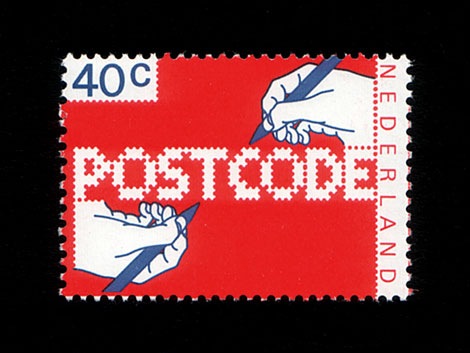
POSTCODE
by nitradaBalanced Rating: 7.55
Average Rating: 7.50
Click for more information about this rating. 26 votes You voted ? for this FontStruction. You may change your vote at any time.
Last edited: 4th January, 2009
Created: 6th June, 2008
This is still work in progress, a lot of characters missing. There are only UPPERCASE characters available, I filled the lowercase letters with random symbols/patterns. The design is based on this stamp design from 1978 by Gert Dumbar. Use font sizes 64, 128 or 256px. Set leading to 24 (for font size 64), 48 (for 128) and 96 (for 256). More information
'Phags-pa Tibetan
by ArakunBalanced Rating: 8.38
Average Rating: 8.54
Click for more information about this rating. 13 votes You voted ? for this FontStruction. You may change your vote at any time.
Last edited: 8th July, 2016
Created: 28th June, 2016
My take on the Mongolian 'Phags-pa script designed by the Tibetan monk Phagspa in 1269, based on the Tibetan script, to write Mongolian, Tibetan, Sanskrit and Chinese. This font is based on the Tibetan style which consists almost entirely of straight lines and right angles. It seemed like a prime candidate for a FontStruct treatment. I've added rounded corners and serifs to make it more visually interesting.
The script is written in vertical columns top-to-bottom and left-to-right and thus needs to be rotated 90° clockwise and the columns then reversed.
'Phags-pa was added to the Unicode standard in version 5.0 in 2006. This font however uses an ad-hoc mapping to Ascii characters which admittedly doesn't always make sense. I kind of gave up in the end and started assigning a bunch of letters to digits. Letters are connected into syllable block by a thin line (mapped to '-'), usually on the right-hand side. A straight line clashed wth the serifs so I made it into a small arch.
The script is an abugida: the vowel ‹a› is inherent in each syllable and thus not written.
vernacularpetra2016_juan15006
by JR_221196Balanced Rating: 0.00
Average Rating: 0.00
Click for more information about this rating. 0 votes You voted ? for this FontStruction. You may change your vote at any time.