

Help : Advanced Topics : Kerning
Kerning
If you haven’t done so, please read the article on spacing before this one.
Kerning is the adjustment of the space between specific pairs of letters. It provides a very precise control of how your font design is spaced in use.
Before exploring kerning, a couple of things to bear in mind:
* Many FontStructions simply do not require kerning. We strongly recommend that you don’t kern unless you are really sure that you need to.
* Do as much to achieve the spacing you want using the other spacing controls at your disposal before resorting to kerning. Many spacing issues can be solved simply by adjusting letter width and the global letter spacing.
* If you kern a pixel font, we recommend you stick to whole units (1 unit is actually a grid square) rather than fractional ones, otherwise you may see undesired antialiasing of pixel edges in certain software.
How does kerning work in FontStruct?
Kerning is available in “Expert Mode”. Once Expert Mode is activated, a ”Kerning” option should appear in the menu. Select that, and the kerning window should appear:
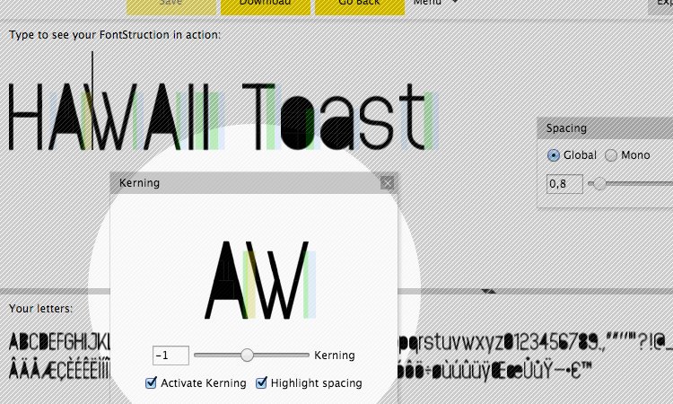
The kerning window works together with the “Type to see your FontStruction” preview panel. You can type any text in here which you wish to kern. In the example above we have chosen the words HAWAII and Toast to focus on the AW, WA and To kerning pairs.
You can select a kerning pair using the cursor in the preview panel, or, if you click on the letters in the kerning panel, you can also type pairs of letters there.
Adjust the kerning simply by entering a value in the box, or by using the slider next to it.
You can turn kerning on and off with the ”Activate Kerning” checkbox. This allows you to compare kerned and unkerned text and to gauge your progress. Note that deactivating kerning is just a previewing function – your downloaded font will still be kerned.
Using the “Highlight spacing” checkbox, you can see the various components of the space between letters. The space to the right of each letter (by default 1 grid square) is shown in green. The font-wide spacing value is shown in blue and kerning is shown in yellow.
Kerning support is simple and basic in FontStruct but in some cases it can help you to solve annoying spacing issues for specific combinations of letters, and improve the quality and usefulness of your designs.
Please contact us if you can’t find the information you’re looking for here.