Is it possible -- just possible -- that it's a typo in the description? That @MarisaKirisame meant to say "including" those listed languages ("...and many more"), not "excluding"? ;^)
@·lucapri-2· (lvqille), Something is telling me to use an interpunct; · for a schwa (or ə in the IPA.) should I choose to use this writing system. It's just a simple dot, which conveys how common the schwa really is in english.


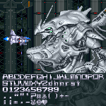
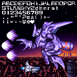


May 1, 2026:
Created font, completed Basic Latin section.
Note that this font does not display properly with OpenType format (TrueType format recommended) .
»