Thank you, @Goatmeal. I've been adding those for the past couple of years, I guess, and I just didn't feel confident enough to push them to public. I still have some more to release, I'll do it soon.
There are stray bricks above and off to the far right of certain letters (I noticed certain words in the “sample text” text suddenly breaking on a new line when there's clearly enough room for them to fit in the rest of that space)


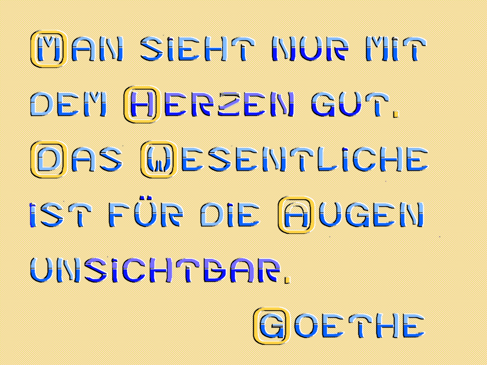


Cool font, but i wrong saying the mopeds monospaced font, srry
»