Messed up bro
Nice and chubby outline font. Not monospaced: I'm glad you didn't squeeze the W to fit into the same space as the I. The spacing is -1 brick;
@four: Thanks a million, compa!
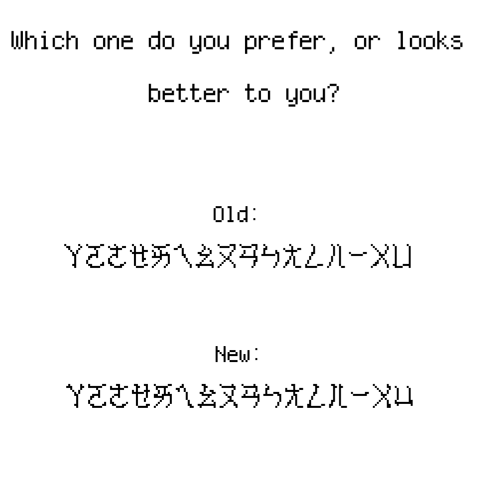
bopomofo is done. however, i need to adjust most characters according to babelstone han’s style.
i am adding bopomofo first before cyrillic because i want to experiment with CJK characters.
It is intentionally messy.
@suesonsimonsson: How can people be big kids and toddlers at the same time?
Why is the lowercase letter N possible? Fix it.
ctcg will clone this font and it'll be InfinPixelSansMax Franchise number 5!
happy waffles day
woah... it took me a second to see the letters, but it's so pretty :0
Wrong font...
Ah yes, Charlie Chaplin.
Also, this font was made to be minimalist.
Did you know that people can download fonts without having accounts? Also, toddlers are from 2 to 3 years old according to me.
4
3
2
1
I think kpopdemonhuntrix means the element numbers (1 for Hydrogen, 2 for Helium, etc.) that appear in a lot of tables.
I don't think there's enough space to fit them inside the boxes without significant changes.
I'll be cloning this
good thing it isn’t corrupted when i downloaded the font file...
oh my goodness, i just got the “newer version exists” warning because of my dumb wi-fi! i was just saving my work but it took too long, so i just
Or might be test this font.




Messed up bro
»