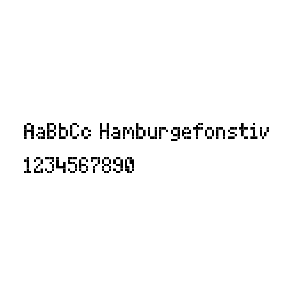
Also, this font was made to be minimalist.
Did you know that people can download fonts without having accounts? Also, toddlers are from 2 to 3 years old according to me.
4
3
2
1
I think kpopdemonhuntrix means the element numbers (1 for Hydrogen, 2 for Helium, etc.) that appear in a lot of tables.
I don't think there's enough space to fit them inside the boxes without significant changes.
I'll be cloning this
good thing it isn’t corrupted when i downloaded the font file...
oh my goodness, i just got the “newer version exists” warning because of my dumb wi-fi! i was just saving my work but it took too long, so i just
Or might be test this font.
Effective mix of stroke weights and some lovely icons.
Excellent. I like how the diacritics are embedded in the outline.
Fascinating and beautiful!
CJK characters will be in sung/ming style.
i completed latin extended-B in just less than 24 hours! (with breaks)
Well, why not make it 7+ or something?
@NewCurvenBig and Miguel Gil: adding the extended Latin characters — with diacritical marks at the top and bottom — would significantly increase the
@TypoMan F & @faux_icing: Fixed. Thank you both for your kind comments.
Nice work! I have been working on a similar outlined typeface myself but with more rounded corners.
You can consider making the legs of 'J' and
What about this new tilde? This can be a new solution?
@ctcg_ i have a question. why are some of your comments have bad grammar? you usually type in good grammars, which is odd...
Only if this were a display-of-your-taste (i.e. all rights reserved) font.
You didn't removed serifs in other glyphs!
Excellent for Minecraft.
How we can 10000 glyphs? (FONTSTRUCT EDITOR WILL BE MAKE SLOWER)
@Luis Becerra: Nice try. Waiting for the rest.
The letter g (same font)
Who makes ages for font uses?
24 March 2026 19:22 (GMT) I New 10 thousands glyphs.
Also, this font was made to be minimalist.
»