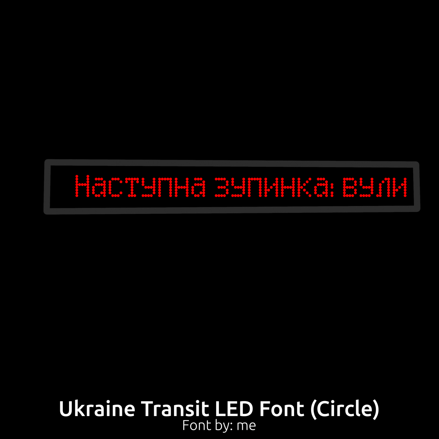
hey this font is EXELENT bro. but a INCRIBLE NEWS this font can be used for KNITTING here in Brazil.
Ei, essa fonte é EXCELENTE cara. Mas uma NOTÍCIA INCRÍVEL essa fonte pode ser usada para TRICÔ aqui no Brasil.
No Man... i Nedded This Font And Perhaps This Is The Unique Font Equal for This :(
(F to me...)
2026
can i clone this to make the 7 look straight? i wanna make my own but i suck at drawing fonts (for example my rendering sans that i made, its private) so i can use it for my cctv video
do latin-1 supplement
그 죄송한데 따로 날개셋 같은걸 다운받아야 되나여 ㅠㅠ
안녕하세요. 제가 그래서 폰ㅌㅅㅌ뤅ㅌ에 자모 35자와 완성형 11,172자를 추가해 달라고 메일을 보냈어요. 빨리 해줬으면 좋겠네요! ^^ (16년 전 작품에 댓을 단 저를 과연 보실까요)
wow it's so cool!
ไม่ใช่ทุกสัญลักษณ์ของไทยที่สามารถแทนด้วยอักษรละตินได้
@Elmo I always welcome suggestions. Due various connecting heights these connected styles can never get as fluent as real hand writing, unless there
It's great that you're not discouraged by others seeing what you do. Also great fontstruction!
@elliqvi THAT IS THE LAST ONE, and that is enough. (They said to do by May 30) And also I read it.
Sorry, didn't know! (The link is supposed to send you to a chess board editor with each side having 31 queens and 1 king.)
Wow! Very cool.
Yea, but how to contact @meek to Re-release color competition?
No, too big
Would something like this work better for the at sign?
It's nothing!
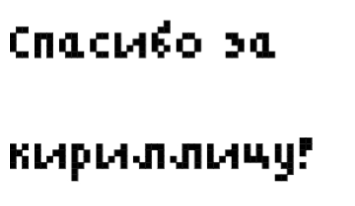
Thanks for Cyrillic!
<b> what </b>
what
Go here: This Link Is SO COOL.
Sorry, I don't understand Yoruba. Can you also add translated English?
That is so amazing :D
@ctcg Read the blog again.
nice 10 stars
thank you latinagari man
Vẹry cọọl like chickẹn KFC
It's in an expanded font
Ẹ dúró ná, ta ni ẹni tí ó ń dánwò yìí wò?
Font showcase
what do you guys think?
i think you forgot to fix the width of the `
WoAh Th15 15 So CoOl
@Meek and Elmo: Thank you, much appreciated! @Jeyco: Thanks! That's a nice find! Funny how their 't' was interpreted by me as 'k' over here, ahaha.
ok i didn't chekc on this in a while let me clarify the diagonals are in fact discontinuous segments






hey this font is EXELENT bro. but a INCRIBLE NEWS this font can be used for KNITTING here in Brazil.
Ei, essa fonte é EXCELENTE cara. Mas uma NOTÍCIA INCRÍVEL essa fonte pode ser usada para TRICÔ aqui no Brasil.
»