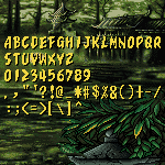
@chirinea - A very nice selection of video game fonts you have just published. They have been added to the “Game Recreations” set. Welcome to The Video Game Font Preservation Society™ ! :^)
@ thalamic: Your comment really touches me. There are so many
talented people and truly skilled Fonstruct experts here. But thank
you for the compliment.
In fact,
This is by far the best and most comprehensive vector graphics display font I have ever seen. I realistically think that I could have seen something almost identical to this font in real vector systems like anything on the Atari Vectrex.
@beate: This is absolutely brilliant. How did you build perfect
curves while maintaining the same stroke width? Your font reminds
me of Courier New, which I'm very
V. Sarela (@Yautja), I've not been in this for like…too long, so
I guess I'll take a look at some Top Pick, and I did notice that Y
with nodes and stuffs,









Nice dingbats. 10/10
»