Humaira. Used to write Jawi script. It's on Omniglot.
cool
hello?
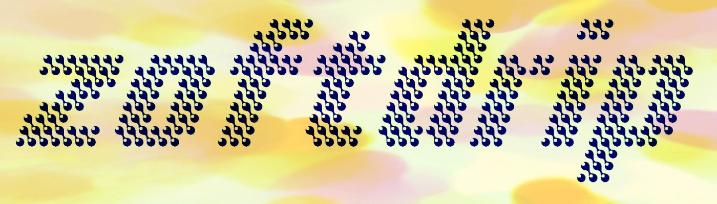
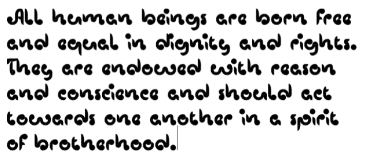
Inspired by this pretty font by fugitiveglue. I've added a bright point on each little ball. Better see at big size.
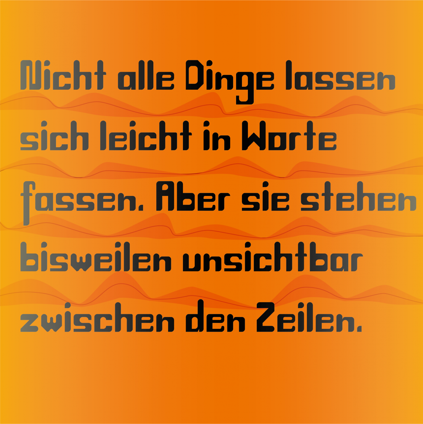
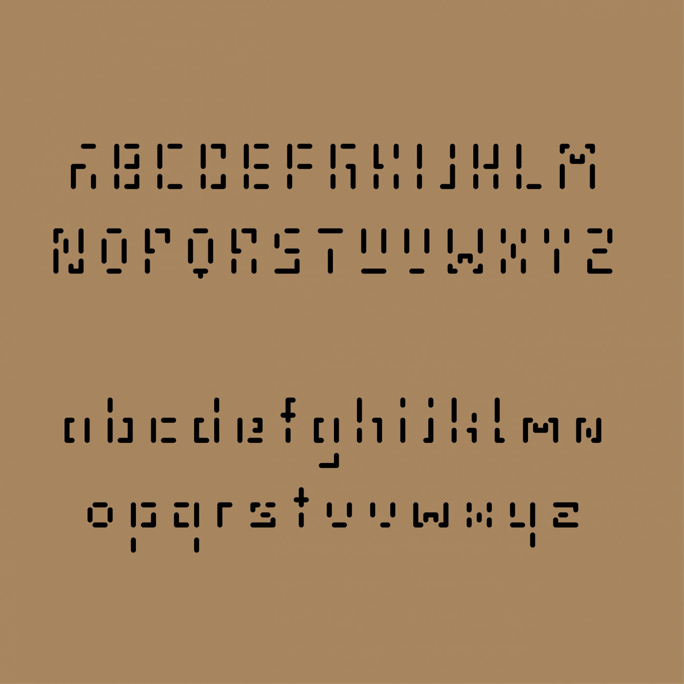
Extreme stencil. I like some of the solutions you've adopted here.
Nice idea and well executed. Your second example shows the best side of the font.
I'm not rude, just asking
What does eYe/FS mean?
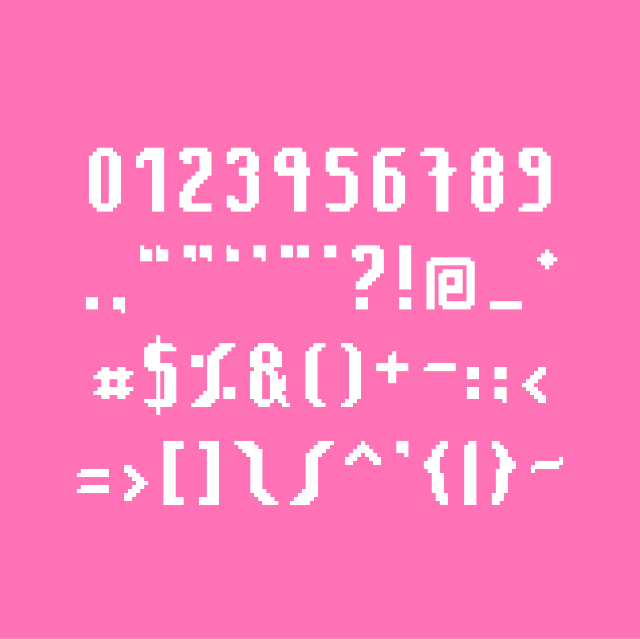
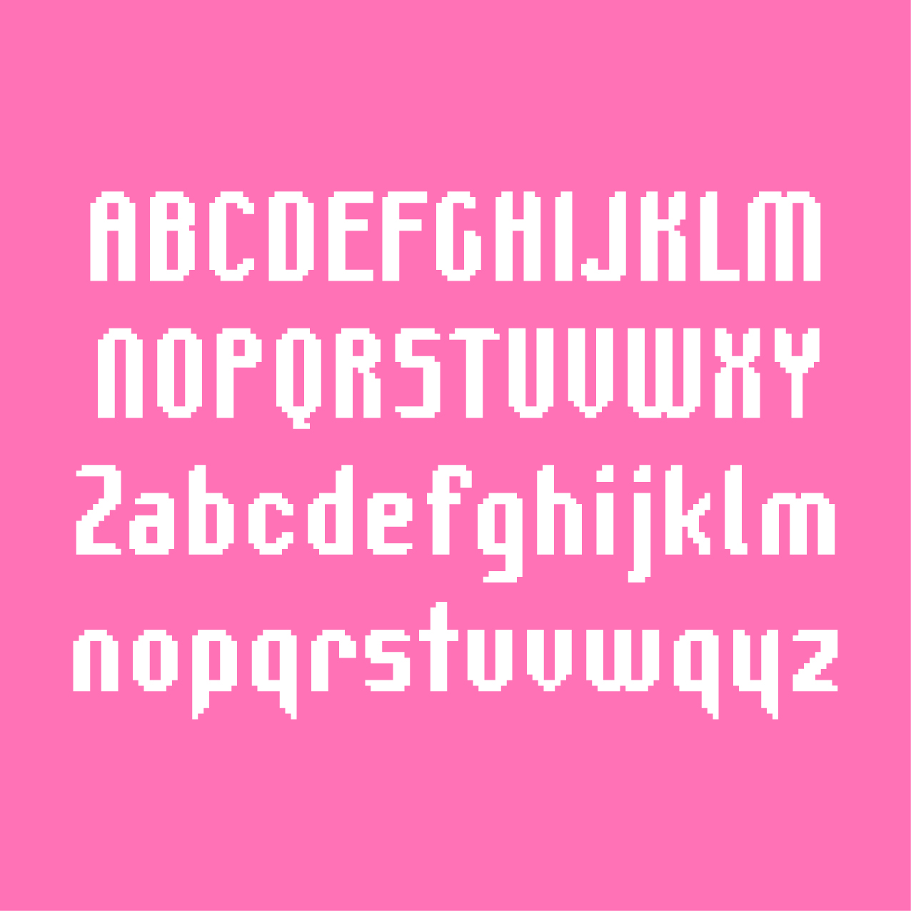
I love your glyphs what
luas.
The following changes have been made: the J and M were redesigned, to the N ink traps were added, and the R, x, Ø, ø were modified. The position of diacritical













Humaira. Used to write Jawi script. It's on Omniglot.
»