Today's Recommended
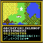
Thanks! And I formed the glyphs entirely with my mouse while keeping the legibility.
500 characters
Very nice hand-drawn letters. The text is well-balanced and pleasant to read. It needs kerning here and there. Did you do it with a pen and tablet? 10/10
Simple, yet very well executed 10/10
𝖶𝖧𝖮 𝖣𝖨𝖣 𝖳𝖧𝖨𝖲? (𝖳𝗁𝗂𝗌 𝗂𝗌 𝖺 𝟣/𝟣𝟢 𝗋𝖺𝗍𝗂𝗇𝗀)
AND IF I DO NOT GET A DIRECT ANSWER, THIS WILL BE REPORTED TO ROB MEEK. THE MEAN FONTSTRUCTER WHO DID THIS SHALL BE
did fontstruct's comments break or something




Today's Recommended
»