I was expecting one of these to be folded paper added to the printer trae.
Nice! 10/10
The ? should be backwards though
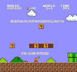
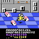
18/09/2026 Update:- Improvement and adjustments to some glyphs to adapt with other fonts.
I currently don't have a time to expand the Ghea Code font yet…
thank you!






I was expecting one of these to be folded paper added to the printer trae.
»