2026 09-21: After recently observing another FontStructor's clone of this font, I noticed that the stem of the original 7 made it 1 brick shorter than the other glyphs. It had been corrected.
See, @redux, I _have_ been paying attention to your font comments! ;^D Also, High Score input for the win! I used those many times along with memory dumps. :^)
I've added a complete set of Cyrillic small caps. They are important for maintaining typographic consistency and high-end aesthetics in multilingual typesetting.
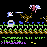
here's the memory dump snapshot i used as reference (though admittedly, for the uppercase, i ended up using the highscore input instead of trying to piece together the four tiles per character)






2026 09-21: After recently observing another FontStructor's clone of this font, I noticed that the stem of the original 7 made it 1 brick shorter than the other glyphs. It had been corrected.
»