Vẹry cọọl like chickẹn KFC
It's in an expanded font
Ẹ dúró ná, ta ni ẹni tí ó ń dánwò yìí wò?
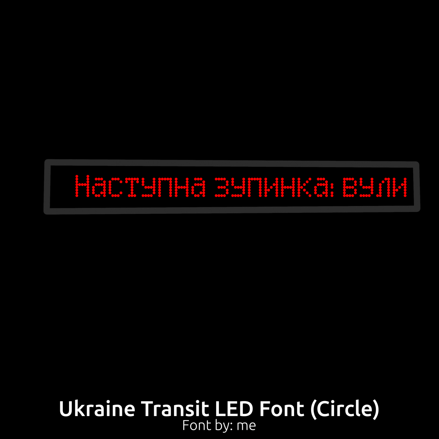
Font showcase
what do you guys think?
i think you forgot to fix the width of the `
WoAh Th15 15 So CoOl
@Meek and Elmo: Thank you, much appreciated! @Jeyco: Thanks! That's a nice find! Funny how their 't' was interpreted by me as 'k' over here, ahaha.
ok i didn't chekc on this in a while let me clarify the diagonals are in fact discontinuous segments
That classic Sonic 1/2 Game Over screen still hits differently, especially after losing rings right before the final stretch. Old-school games really knew how to make players stay focused. I get the same intense feeling
Good luck to all of the Doritos Logo winners today at the event at the Doritos
@bwm i meant something like this
mine is D in green!
Blood blood blood BLOOD BLOOD!!




Vẹry cọọl like chickẹn KFC
»